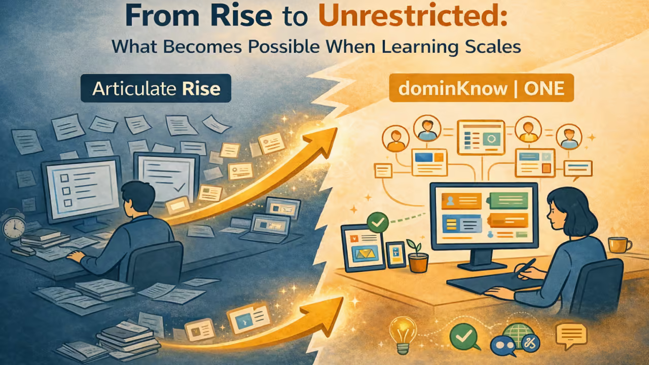
From Rise to Unrestricted: What Becomes Possible When Learning Scales

Illustration showing learning scaling from Rise to a flexible, single-source eLearning platform
Calendar icon
January 22, 2026
Clock icon
Illustration showing learning scaling from Rise to a flexible, single-source eLearning platform

In the first article of this series, we explored a familiar moment many learning teams encounter: when a tool that worked well early on begins to result in feelings of constraint as learning programs grow.

The challenge is rarely about starting over.

More often, it is about how to scale learning without sacrificing design, flexibility, or the work already invested.

That question was at the center of a recent webinar, Beyond Rise: Unrestricted eLearning Design at Scale, where instructional design leader Jacqueline “Jac” Hutchinson of eLearning Pros shared how her team moved beyond the limitations of template-driven authoring while preserving existing content and workflows.

What follows isn’t so much a story about switching tools, albeit that did happen. It is about what becomes possible when learning teams remove structural constraints and design for scale from the inside out.


The Real Barrier to Growth Is Not Content

One of the biggest misconceptions about scaling learning is that content volume immediately results in a problem.

In reality, most teams already have plenty of content. What holds them back is how that content is structured, reused, and adapted over time.

Common friction points include:

  • Maintaining multiple versions of the same course
  • Supporting different audiences with overlapping needs
  • Updating content without rework
  • Preserving brand and design intent as libraries grow
  • Gaining insight into learner behavior beyond completion

Scaling learning successfully requires addressing these challenges without forcing teams to rebuild everything from scratch.


Conversion as a Starting Point, Not an Endpoint

For many organizations, the idea of leaving Rise behind triggers anxiety. Years of content represent real investment, and rebuilding course by course is rarely practical, no matter how frustrated the team may be.

That is why conversion matters.

During the webinar, Jac described her initial skepticism when converting Rise courses into dominKnow | ONE. That skepticism quickly turned into confidence when the converted courses preserved structure, content, and interactions with minimal cleanup required.

Conversion does more than migrate content. It creates a foundation for scale by placing existing learning into an environment designed for flexibility, reuse, and growth.

From that point forward, teams are no longer constrained by the original template model.

Customer Perspective on Rise-to-dominKnow Conversion

Jack, I know you were coming into this perhaps like many, a little skeptical. Tell us a little bit about your experience and what you were thinking going in, and how those thoughts changed, or didn’t change, by the end.

I was absolutely amazed at the conversion that your team did. I know this course was one of the early conversions.

Since then, we’ve done many more conversions for the same client, converting all of their Rise courses into dominKnow.

Every single one has been absolutely amazing.

When we look at what we imported versus what we ended up with in dominKnow, the difference is night and day.

The content wasn’t just preserved — it was enhanced. The courses became more flexible, more interactive, and far easier to work with moving forward.

What started as a cautious experiment quickly became a repeatable, scalable approach that we’ve now applied across many courses for the same organization.

What we imported versus what we ended up with in dominKnow — the difference was night and day.

Intentional Launch Pages: Designing for Clarity, Not Just Familiarity

When teams move beyond rigid, template-driven authoring, one of the most overlooked opportunities is the launch page itself. Too often, launch pages default to a familiar “menu-style” layout—not because it’s the best experience for learners, but because it’s the easiest or only option.

In the webinar example, the team made a deliberate decision not to replicate a Rise-style menu, even though that option was available. Instead, they redesigned the launch experience to focus on what the learner actually needs to do, not just what content exists.

Rather than presenting a long menu of topics, the launch page clearly communicated:

  • The number of required sections
  • The time commitment for each section
  • The order in which learners should proceed

This shift reframed the learner experience from navigation to decision-making. Learners could immediately answer:

  • What do I need to complete?
  • How long will this take me?
  • What should I do next?

By separating content into visually distinct, time-based segments, the team reduced cognitive load. It removed ambiguity, which is especially important for learners accessing the course on different devices or in short time windows.

The result was a launch experience that:

  • Improved learner confidence before starting
  • Reduced friction and false starts
  • Made the course feel more approachable and manageable
  • Remained fully responsive across screen sizes

Importantly, this wasn’t about abandoning familiarity altogether. In other courses, the team did preserve a Rise-like look and feel where consistency mattered. The key difference was choice: the ability to adapt the structure based on learning goals rather than being locked into a single pattern.

This kind of intentional launch-page design may seem like a small change, but at scale it has an outsized impact—especially for organizations trying to improve completion rates, reduce learner frustration, and create experiences that respect learners’ time.

Designing for clarity at the very start of a course sets the tone for everything that follows.

Launch Page Theme Choice

Come into the launch page?

Yes, it is. But it's using a different theme.

Jack, you wanna talk a little bit about this and why? Yeah.

This particular choice.

'cause there are several choices, not just this

one and the other one in there.

Keeping a Rise-Like Look vs Changing the Focus

Yeah, I mean, if we wanted to have the same rise type look

and feel, which for one client, we actually do want

to have that same look and seal.

And so we've kept everything kind of looking rise like,

but in this case, we wanted the learner to have a little bit

of a different focus on the fact

that there are three things they need

to complete rather than a big menu.

Clarity on What to Do Next and Time to Complete

And to have them click in

and see, okay, it's gonna take me four minutes

for this piece, 40 minutes for this,

six minutes for the last section.

So we wanted to really separate the information for them,

have it a little bit more visually appealing, have it easier

for them to access and responsive.

Give learners a clearer start: what to complete, and how long each part takes.

One Course, Multiple Audiences, No Duplication

One of the most immediate benefits of moving beyond template-based authoring is the ability to support multiple audiences from a single source.

In the webinar example, the same course needed to serve:

  • Staff members, who required deeper procedural detail
  • Residents, who needed a more approachable, streamlined experience

Previously, this meant duplicating courses and managing parallel updates and individual assignments within the LMS. After conversion, Jac’s team was able to redesign the primary course to support both audiences within a single project, with:

  • Audience-specific pages
  • Conditional content
  • Different interaction counts and sequencing
  • Clean numbering and navigation for each learner type

The result was not only less maintenance but also clearer learning experiences for each audience, as well as a reduction in LMS admin and support efforts associated with identifying which course a user should be assigned to and later correcting an incorrect assignment.

This shift from duplication to single-source design is one of the most foundational and important steps teams can take when scaling learning.

Designing for Multiple Audiences

I found that fresh out of school instructional designers are thinking about this, but those who have been out for a while, they’ve kind of stopped thinking about this because it just really wasn’t possible.

And I’m talking about those courses where you have two different audiences. Maybe it’s management and employees.

Shared and Unique Learner Needs

They’re all doing airline maintenance and they have a lot of very same needs. But within that, there’s unique needs as well.

So sometimes people break the course up into smaller pieces to distribute it that way.

Challenges with Duplicated Content

Or they create two completely separate courses, which then leads to duplicated content and maintenance challenges.

And when things change, now you’re updating multiple courses instead of one.

A More Flexible Course Strategy

But if you can build one course that serves multiple audiences, where shared content stays shared and unique content is conditional, that’s where things get really powerful.

It opens up possibilities that just weren’t realistic before.

Why This Was Difficult with Traditional Tools

This approach was really challenging for us. With Rise, we had to create…

“We were maintaining two separate courses and updating both every time something changed.”

Design Freedom Without Fragmentation

Template and block-based tools are designed to reduce design decisions. That can be helpful early on, but it limits how learning experiences evolve.

Once content is no longer locked into fixed blocks, teams gain the ability to:

  • Create varied layouts based on instructional need
  • Use visual hierarchy intentionally
  • Introduce white space, contrast, and pacing
  • Apply brand standards consistently while allowing purposeful variation

In the webinar, Jac highlighted how her team was able to move beyond repetitive page structures and create experiences that felt purposeful rather than formulaic.

Importantly, this design freedom did not require abandoning responsiveness. Courses remained fully responsive while allowing significantly more control over how content appeared and flowed.

Layouts Beyond Blocks

This talks into the next one, layouts beyond the block.

Block repeat and that not just the navigation. Yeah.

But it gives some of the look and feel in there.

And let's take a a look at that just, yeah.

Looking through this course here,

we see here there's a parex effects going in the background.

Laid out this of something a little bit simpler here,

but I know in Rise, one of the things you're like, eh,

it works, but didn't work the way I wanted to.

Right. In terms of the transcript open, having it left

and right, instead of just stacking, you really have a lot

of different choices in here.

Responsive Layout and Connected Content

Coming on with this page here, laying out

with the different items, again, how they're connected,

how they respond in the responsive environment.

Having some of this in, changing that up a little bit

and then having an interactive video.

Brand Realization and Reusable Assets

But tell me a little bit more about the page changes. Yeah.

And the types of things that you could do to

really realize that brand.

The experience, the instructional design.

So remember when this was done,

there have been some updates to both products, both Domino

and Rise since my team took on these conversion projects.

So you have to keep in mind that there are some updates.

Maybe the software does what I wanted it to do at the time,

but we really wanted to have one section that we could work

with of reusable objects or content.

So images, icons, text titles.

There are a number of different things we

wanted to be able to use.

Rise Limitations and Client Expectations

And when you went into Rise, there were the same.

You could have text with an image,

you could have text over top of an image,

you could have a carousel.

To us, it was a little bit limiting,

especially since we're storyline experts, so we already know

how to develop in storyline,

but the client wanted rise,

so we really had some challenges making Rise look the way we

wanted it to look, or would look the way the client thought

it should look because they don't know Rise.

Flexible layouts aren’t just about navigation—they’re about brand, reuse, and better responsive experiences.

Interactivity Without Workarounds

As learning programs mature, interactivity becomes less about novelty and more about effectiveness.

Teams want to support:

  • Reflection exercises that capture learner input
  • Feedback that adapts based on responses
  • Scenarios that mirror real-world decision-making
  • Practice opportunities that reinforce understanding

In Rise, many of these needs are addressed through embedded Storyline blocks. While effective in isolation, this approach introduces fragmentation, especially on mobile devices.

After conversion, Jac’s team replaced Storyline blocks with native interactions that supported:

  • Variables and conditional logic
  • Trigger-based feedback
  • Cleaner mobile behavior
  • Simpler maintenance

The result was not just better interactivity, but a cohesive learning experience that worked equally well across desktop, tablet, and mobile devices. For designers, it also meant working in a single authoring environment, eliminating the need to switch tools, manage multiple source files, or republish content twice for every update.

Interactivity Limits in Template-Based Authoring

One of the issues that comes up again and again is that interactivity can feel restrictive. You may have built-in components, and while those can be useful, the options are often limited in terms of layouts, designs, branching, and other interaction types that simply aren’t possible.

At the time we created the sample we’re reviewing, there were significant limitations on what we could do creatively for learner interaction. We wanted to go beyond what Rise allowed, which led us to rely heavily on integrated Storyline blocks because our choices were so constrained.

If we wanted to do anything outside of what Rise offered, we had to look beyond the tool itself. You can’t simply add a plugin or extend Rise to support more advanced interactions.

And that’s really the point — you shouldn’t have to. With dominKnow, I don’t have to work around those limitations to create the interactions I need.

You shouldn’t have to work around your authoring tool just to create meaningful interactivity.

Reflection, Memory, and Learning That Builds Over Time

One of the most powerful examples shared during the webinar was a reflection exercise that appeared at both the beginning and end of a course.

Learners were asked to record their initial thoughts, then revisit those responses after completing the content. Their original input was preserved and reintroduced later, prompting comparison and deeper reflection.

This kind of longitudinal learning interaction is difficult to achieve in rigid authoring environments. When variables, logic, and persistence are built into the platform, learning can become more intentional and personal without becoming complex to manage.

For teams focused on behavior change, not just information delivery, this capability is transformative.

Designing Reflective Learning for Empathy and Context

This was a type of reflective exercise designed to get people to pause and really think about what they are doing as they enter the course.

Learners are prompted early to take a moment to reflect and type in their thoughts. This content was designed for both employees and residents in a substance use recovery environment.

It’s important to remind staff who have worked in recovery residences for a long time what the experience can be like for someone new to the program. Over time, familiarity can make it easy to forget why certain procedures feel stressful or overwhelming to new residents.

Learners are asked to reflect on the challenges someone may face when entering a recovery residence. This context helps them better understand why processes like urinalysis can be stressful and emotionally charged.

For some residents, participation in urinalysis may be tied to serious consequences, including legal outcomes or the risk of losing their housing within the recovery residence. These realities make the process deeply meaningful and high-stakes.

This reflection is critical to understanding the success of someone entering a recovery environment. From an instructional design perspective, learners are asked to reflect at the beginning of the course and then return to their original thoughts after reviewing the content.

The system allows learners to recall and revisit what they initially wrote, supporting deeper reflection and learning continuity. This type of reflective experience was not possible in Rise at the time.

The approach relies on a full variable system, including system variables, project variables, and reusable global variables, allowing learner input to be stored and reused throughout the course.

By capturing learner input early and revisiting it later, reflection becomes part of the learning journey—not just a moment.

Scenarios That Inform Design Decisions

Scenarios are often treated as assessments. In practice, they are also diagnostic tools.

In the webinar example, scenario responses were tracked using xAPI, allowing the team to see:

  • Which choices learners struggled with
  • Where misconceptions persisted
  • How often learners needed to retry

This data closed the loop between design and outcomes. Instead of assuming content effectiveness, the team could refine instruction based on real learner behavior.

Scaling learning is not just about delivering more content. It is about learning faster from learners.

Scenarios and Branching

Let's talk a very briefly about scenarios.

So this is a built in, of course you can do your own custom branching, but this was a one-on-one discussion.

When you first were using rise, there were some limitations.

They actually wanted a custom character. Couldn't do that.

So you're choosing a, I didn't want a character. Ultimately.

You didn't do a scenario on that. No, we didn't.

But when you went over to Domino, you had that capability to do a scenario.

Scoring, Feedback, and Visualizing the Scenario

Mm-hmm. And we'll open that real quick here.

We wanted to be able to treat this like almost like a knowledge assessment, right?

Where we could give them a score at the end and say, Hey, you did it. Good job.

Where, oh, I think you need to try this again.

So we could give them a score. We couldn't do that in Rise.

So there are a couple of things that I absolutely love about the Domino scenario.

Features that help me work, and this is one of them.

I can see my build and I can look at all of the feedback that I'm gonna give my learner.

And you know, the connections between, if they answer this correct, they're gonna get a hundred percent score if they get all the way through.

And because scenarios can be quite complicated, having that visual is really nice.

They wanted a custom character, which we haven't finalized yet, which is why we've just chosen a blank character for this.

Once we give the custom character that they've determined they want, we'll add that in.

Using xAPI Data to Improve Content

And I know as your team was looking at XAPI, one of the other appealing things was, hey, this score, as well as what choices they were picking are that's automatically sent as part of that XAPI data for the learners there.

Because as an instructional designer, it's important for me to know what are they selecting because it's based on the content that they just covered, covering the 12 steps above or the eight steps above.

So if they're not making the right selections to get through, or how many times they're taking it, if they're trying again, exactly, then I need to know, do I need to go back to my original content and make changes to that so it's more easy to understand.

Turn branching scenarios into measurable learning—score it, track choices with xAPI, and improve the content based on real learner data.

Scaling Without Sacrificing What Matters

The throughline in this journey is not replacement. It is an expansion.

Moving beyond Rise did not require Jac’s team to abandon what worked. It allowed them to:

  • Preserve existing content
  • Expand design capability
  • Reduce duplication
  • Support multiple audiences
  • Improve insight and iteration

Most importantly, it allowed learning to scale without sacrificing design quality, learner experience, or team sanity.


What Comes Next

Every learning program reaches a point where templates or fixed block designs alone are no longer enough.

The teams that scale successfully are not the ones that rebuild everything. They are the ones who choose platforms designed to grow with them.

If your organization is asking how to scale learning without sacrificing design, engagement, or control, the answer may not be to start over, but to unlock more from what you already have.

Ready to explore what dominKnow | ONE can do for your organization? Schedule a call with our team and let’s explore your organization’s needs together!

Attachments
View File shared in this episodeView File shared in this episode
Coffe Cup with text Instructional Designers in Offices Drinking Coffee #IDIODC

New to IDIODC?

Instructional Designers in Offices Drinking Coffee (#IDIODC) is a free weekly eLearning video cast and podcast that is Sponsored by dominknow.

Join us live – or later in your favourite app!

LEARN MORE